A map is usually defined as a graphical representation of a surface. An image of a city, country or a continent is caught in several gridlines in a map showing its physical features and relative locations. From the ancient period, map was used to navigate to different undiscovered places, to find routes through the sea, mountains and forests to get into new places. Merchants, colonisers, even vikings have added their contributions in the evolution of maps. It’s not to say that all contributions were equal, and the way maps were drawn reveal numerous biases.
Dymaxion Projection
Mercator Projection
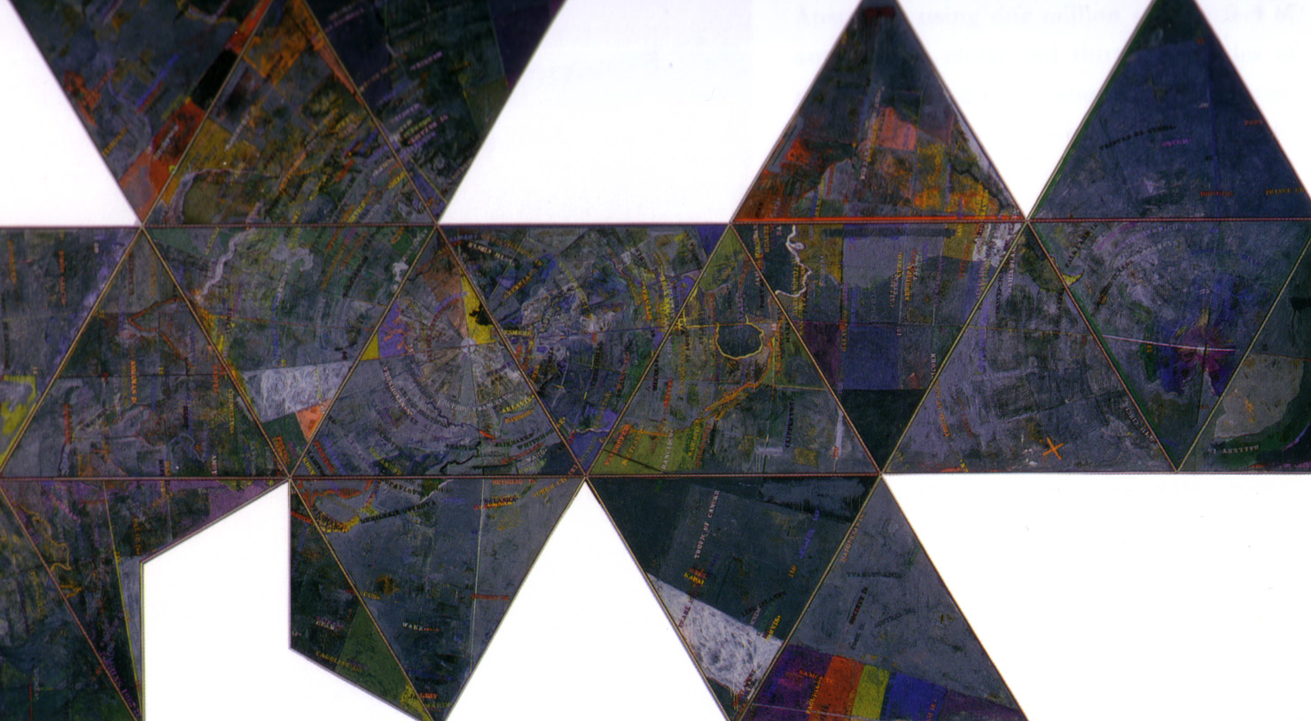
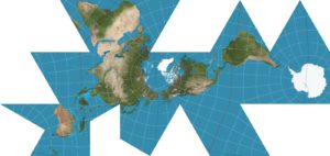
Just looking at a standard globe will reveal a Eurocentrism that has been and is still plaguing the way the world is being represented on maps. The Dymaxion Map by Buckminster Fuller—American architect, systems theorist, author and inventor – is a true revelation that would challenge the biases of mapping at the time. Perfectly mapping a sphere onto a flat surface is impossible. Attempts to do so in the Mercator Projection and MacArthur’s Map representing the globe are grossly distorted and fail to show any form of scale successfully. For instance, Greenland, a landmass fifteen times smaller than Africa, is shown to be nearly the same size in the Mercator Projection. Fuller’s map mitigated this problem to a great degree as he embedded the globe on a twenty-sided solid shape, as the twenty triangles of equal area reduce the relative amount of projection from a curved to a flat surface. Fuller’s map is not just a technical achievement but also a bedrock for the way mapping should be approached. It sets to question why things were mapped the way they were, such as orienting the globe with the north side up and isolating landmasses. As with any work of representation, the work only reveals what the author wants you to see. What it means is that it is essential that one reboot one’s perceptions to get rid of of preconceived notions, and to produce a true representation of a place through mapping. The Dymaxion Map did exactly this, forcing cartographers to rethink the way they were mapping. It questioned not only how to map, but also what to map and sought out how to convey the sense of a place in a more comprehensive way.

Projection Based on Buckminster Fuller’s Dymaxion Airocean World
When one talks about a place, an image comes to the mind which occupies a certain dimension, an area which consists of different layers of features. The layers are made of tangible features like seas, rivers, hills and plains, which can harbour a living environment. There are other layers which can be sensed and measured called climatic features equally facilitating living organisms. Every species, including humans, have their own method of inhabiting places. Cities, towns or villages are the names of patterns of human society and settlements. American urban planner and author Kevin Lynch, in his much known book The Image of the City, outlines the concept of legibility of a city. He describes legibility as the way the city can be read. He states in the book: “In the process of way-finding, the strategic link is the environmental image, the generalised mental picture of the exterior physical world that is held by an individual. This image is the product both of immediate sensation and of the memory of past experience, and it is used to interpret information and to guide action.” He characterised and defined paths, edges, districts, nodes and landmarks as aspects of a mental map. A clear mental map is essential to the conceptual organisation and communication among the dwellers of any place and has the ability to deepen the human experience. A map has the potential to be accessible to all, regardless of their specialisation, occupation and character. It is a service tool which can relate to an individual’s thought, need and expectation, through which a citizen can be benefitted. They can use it for their different purposes and contribute to it. For instance, we can indicate the intensity of the loudness of sound generated from daily traffic that exceeds the sensitivity level of humans in a city map, adding a different layer of lived experience that can be read.
In 1957, a group of activists in France, known as the Situationists, started using psychogeographical approaches to allow for an impression of the space so they could determine an urban environment. Using personal experience they produced maps to suggest journeys and connections to promote the notion of drifting through the city. The self-proclaimed leader of the Situationists, Guy Debord, challenged the idea of the city being a real physical environment. In his view, a city’s pageantry was a way to mask the ways capitalism degrades human life. The act of losing oneself in the city was the pursuit of the Situationists and the physical journey was also a means to escape from the conditioned reality. The Naked City was the first of the three parts of the Situationists’ case study on Paris, which helped explain the way the Situationists saw the condition at the time when people were only beginning to be dramatically influenced by modern technology and capitalism. To the Situationists, these two influences were stripping the people of the way they could truly experience life. The Situationists saw no freedom for the individual to go in the direction they wanted as they were being set to one particular form of living. In each experiment in The Naked City, they were motivated to drift through the city and determine routes affecting their mood and behaviour, all the while illustrating their claims that urbanism represented a drive to rationalise, normalise and commercialise Paris.
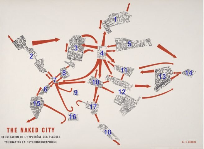
The Naked City: Spectacle of the Society
The Formulary for A New Urbanism, written by French political theorist, activist and poet Ivan Vladimirovitch Chtcheglov in 1953, was the basis for the Situationists’ theories of designs for new cities. Here, Chtcheglov addresses the problems of the city. He says “A mental disease has swept the planet: banalization. Everyone is hypnotised by production and conveniences—sewage systems, elevators, bathrooms, washing machines.” His idea for the ideal city is one where the inhabitants participate in a continuous “dérive”—which according to Debord was “A mode of experimental behaviour linked to the conditions of urban society: a technique of rapid passage through varied ambiances.” The changing of landscapes from one hour to the next will result in complete disorientation, which Chtcheglov found to be quintessential to the experience of the city and believed could be accomplished by the manipulation of architectural time and space. The Situationists’ proposed solution for the urban problem was Constant Nieuwenhuys’ New Babylon, meant to be a labyrinth city hosting the pneumatic behaviour of the playful human.
American artist, author and cartographer Denis Wood remarks on the differences between Kevin Lynch and the Situationists’ psychogeography in his article Lynch Debord: About Two Psychogeographies in which he outlines the differences in their approaches. Woods explains that both approaches were equally sincere and tried to ensure objective, reproducible results while measuring details of the environment that were unquestionably human. Where they differed in his view was in their approaches dictated by their backgrounds. Even though the Situationists’ project was purely theoretical, there is something to be learnt from their approach. Despite being outsiders from the guild of the policy-makers, they were able to bring their views to the forefront of intellectual discussion using mapping as their tool employing thorough investigation and ethical interpretation. Perhaps the only person to have demonstrated this better was the English physician John Snow.
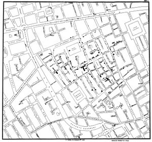
Voronoi Diagram by John Snow
The pump on Broadwick Street, which in 1854 was Broad Street in SoHo, London, commemorates one of the most significant moments in British medicine and a triumph of investigative mapping. When he was 18, John Snow was sent alone into coal slums to treat coal workers dying of cholera. This was before the acceptance of germ theory; the medical community at that time believed that diseases spread through “miasma”—a general atmosphere that harboured diseases that you contract by breathing in. So despite his training, Snow was unable to save any of his patients. However, he had noted in his journal his observations and theories of treating the coalminers meticulously. He saw that coal workers would often contract the disease deep in the coal pits, far away from the graveyards, sewage pools and swamps that the infectious miasma was thought to seep from.
Years later in 1848, during another massive cholera outbreak, Snow became certain upon investigation that this disease was transferred from one man to another and not through miasma. So when cholera once again returned to London in 1854, John Snow planned to prove that outbreaks of this disease, which he had dealt with his entire life, could be contained by restricting consumption of contaminated water. During the cholera outbreak of 1854 in London, there didn’t seem to be any pattern of outbreak at all. It struck all over the city and broke all class, gender and age barriers. Snow’s hypothesis was to be tested in one of the grandest feats of statistical survey and mapping done to that day. With diligent investigation he was able to isolate water sources. One of them (Southwark and Vauxhall) was getting their water from downstream of where the sewage emptied into the Thames, while the other (Lambeth) had recently moved their facilities upstream. To prove his connection Snow began to canvas two of London’s districts that had recently been hit hard by the epidemic. He heavily and thoroughly surveyed the community. He collected samples of water, which he then tested. His records showed that 38 of the 44 deaths that had occurred that month, had consumed Southwark and Vauxhall’s water. Then on Tuesday morning, the 4th of September, a massive cholera outbreak had struck Broad Street. Snow had to assimilate all he had learnt and prevent an ongoing onslaught of cholera deaths. That afternoon, he went to the office of the Registrar General of London to get a complete list of every death and an address for everyone that cholera had taken. Then in order to establish a pattern he used ground inspection combined with government records and began to craft Snow needed to know not only the relation between the casualties, but also how they related to the neighbourhood water supplies. So through spontaneous improvisation, he created what we know today as a Voronoi diagram, an attempt to find the fastest way to understand the problem he faced. Using this he broke up the map by proximity to wells and showed a pattern where the most deaths had occurred, and isolated the contaminated Broad Street pump as the source for contaminated water. Then he began investigating the outliers to remove any shadow of a doubt over his findings, that were sure to be raised by the miasmatists. For forty-eight hours he chased down data, mapped, plotted his statistics and tried to understand his findings. Armed with his research, Snow met the local health commission on a Thursday night and addressed them, eventually convincing them to remove the handle from the pump the following morning. By Monday, the epidemic had almost passed. For anyone working with maps, this story is one of the prime examples of how mapping can quite literally save lives and asserts the importance of ethical investigations for mapping. Snow’s story also shows successful activism through mapping, as he had an uphill struggle to get his point across to a community dead set on believing something wrong.
In a more contemporary setting, a non-profit technology company called Ushahidi has shown how to map incidents of violence through crowdsourcing. In the aftermath of the presidential election of Kenya in 2007, the service mapped eyewitness reports of violence and plotted them on Google Maps. The reports were sent via email and text messages which enabled responders to rescue victims much more quickly and allowed the reports afterwards to be more accurate and detailed. The same service was used to track anti-immigrant crimes in South Africa in May 2008, violence in Congo in November 2008, aid earthquake victims in Haiti and Chile in January 2010 and September 2010, respectively. Using new technologies and integrating real life scenarios into maps, Ushahidi has shown how extensive the usage of maps can be.
We are continuously living in an interactive situation with our environment, climate and the ecosystem. In this process, it is now very important to know how we understand our surroundings, how we perceive the interaction and how we affect it. Now we need to be able to represent our experience through a map. Map is not only a graphical representation of a surface and its physical features that we can see, but rather a graphical representation of our experience and picture of our interactive behaviour which we can sense. Be it for personal everyday use, or policies affecting everyone, maps are as essential for humans as the ultrasound radar is for a bat.
This article is from the upcoming issue of VAS. Click here to see the previous issues.
