One of the unnerving things about Covid-19 – and there are many – is lack of definitive information. We would like to know how the virus progresses (and regresses) in a location, what is the rate of its spread, what conditions may slow down its rate, and what can a comparison between locations suggest, but in most cases we do not have adequate answers.
A COVID-19 tracking platform was very much needed for Bangladesh but now thanks to the State Minister for ICT Division, a platform has been launched on 20 April, and can be accessed through http://covid19tracker.gov.bd/. It should be obvious that digital platforms involving geographical information and analyses are critical to tackle any national disaster and emergency. For dealing with the impact of COVID-19, and future public health crisis, a better integration of digital infrastructure associated with geo-spatial mapping data collating should be a priority.
Mapping is an essential – and primary medium – for tackling any disastrous situation such as health crisis, natural calamity, war, etc. Perhaps the first health based mapping was inaugurated by John Snow when he produced hand-drawn paper maps of cholera cases during the cholera outbreak in Soho, London in 1854. In the current context, South Korea for example presents a more technologically advanced case. Being the second-worst affected country after China at the beginning of the global outbreak, the East Asian nation was successful in taking control of the situation without even enforcing a lockdown. Having the finest geoinformation researchers, South Korea tackled COVID-19 by wisely, practicing and implementing AI (artificial intelligence) in mapping people’s movement. Needless to say, such practices have also raised legitimate controversies.
Facebook recently launched its new interactive map that displays reported county-by-county COVID-19 symptoms from users across the US. Although the issue of infringing on individual privacy remains a serious matter, the initiative will definitely help local governments and public health officials better understand where to allocate resources and, eventually, when it is safe to start reopening from lockdown. This is a practical example of the application of “spatial,”, or more precisely “space and time” infrastructure in responding to global crisis.
To effectively ‘flatten the curve’, as this new phrase enters our thinking and planning, we need information, more precisely geo-information. As we are in a global pandemic situation, we need to work with a global spatial platform.
The Center for Systems Science and Engineering (CSSE) at Johns Hopkins University (JHU) in the USA developed an ambitious, wide-ranging research effort to understand many challenges presented by COVID-19 such as tracking and enumerating the virus, and consequently preventing its spread and impacting hospital preparations. Launched on 22 January, the JHU team established a real-time COVID-19 tracking map that reports data of confirmed cases associated with some other statistical representations across the world. This tracking initiative has become the most cited source of COVID-19 spatial data for many scientific institutions, government officials, public health scholars and mainstream media to collect, collate, and interpret. JHU uses this web-based geographic information systems (GIS) platform that can ingest big data from their sources and display results in interactive and near-real-time dashboards. Thus we see a new dimension (real-time visualisation) of spatial science in the field of applied health geography.
Bengal Institute’s COVID-19 Dashboard Using Mapping and Analytics
Map-based dashboards become crucial when both disease and information become highly time sensitive. First published at the beginning of this month, on 8 April, the dashboard created by Bengal Institute for Architecture, Landscapes and Settlements has been attracting wide responses from all over the world. Anyone with internet connection can explore and get a tremendous amount of data and information about the SARS-CoV-2 coronavirus from this website: https://bengal.institute/covid19.
Although Bengal Institute is not the primary source of any of the data on the dashboard, the uniqueness is in visualising maps, selecting information layers, and critically assembling the data with multiple layers of information. Such an assembly of critical information might be helpful for a better understanding of the nature of the outbreak and its possible correlation to other environmental and social parameters. The trans-disciplinary institution has a team of well known geo-spatial researchers under the Geography Research Unit, which is now dedicated to COVID-19 data analysis and research for the last couple of months. Authoritative data sources for Bengal Institute’s dashboard include WHO, Coronavirus Resource Center, Johns Hopkins University, IEDCR, Earthdata, Worldometer, BCG World Atlas, Malaria Atlas Project, Air Traffic Management (ATM), and EarthExplorer.
At Bengal Institute, the necessity for layering multi-topical information on the global Covid map was triggered by an ongoing series of revelations and speculations, some of which have created questions and confusions. For example, a group of researchers from the New York Institute of Technology (NYIT) stated on 28 March that the countries without universal policies of Bacillus Calmette-Guerin (BCG) vaccination (preventive measures to TB) such as Italy, the Netherlands, and the US, have been more severely affected compared to countries with universal and long-standing BCG policies. Consequently, the Bengal Institute dashboard added a layer that represented BCG vaccination status of every country. While WHO does not confirm a relationship between BCG vaccination and COVID-19 outbreak or transmission, still anyone can enter the Bengal Institute’s COVID-19 dashboard to consider any possible correlation. Similarly, people can explore different parts of the world and find potential patterns of COVID-19 and malaria infected regions. From Bengal Institute’s interactive map, people can independently overlay a number of confirmed infections, fatalities and recoveries with such layers that may help to assess the factuality of some of those claims.
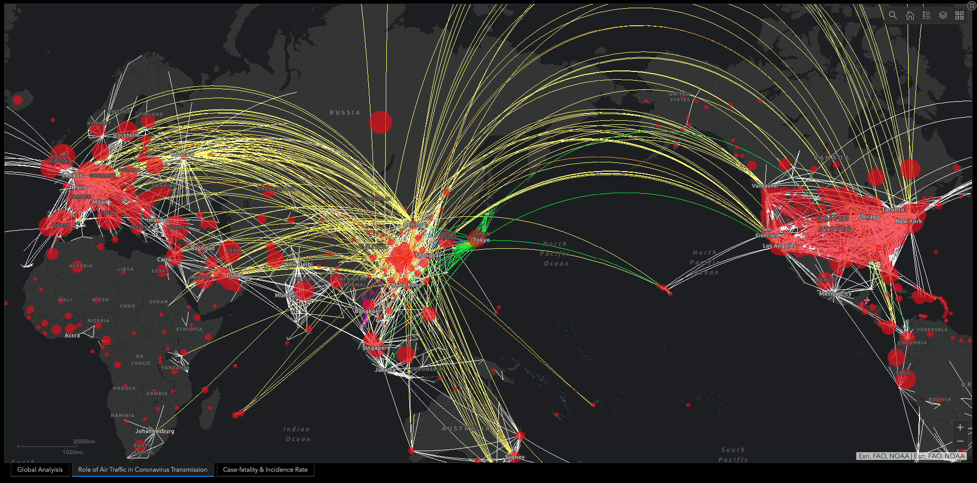
On the other end, global international travel patterns for business, tourism, etc., needed to be closely understood for tracing the COVID-19 outbreak. Published by PNAS on 13 March, a research paper authored by a group of multidisciplinary researchers showed that international flights have brought a total number of 566 COVID-19 cases to 26 countries within 2 months since the outbreak was first reported on 31 December, 2019. Hence, in addition to health matters, the Bengal Institute dashboard shows in one section the air traffic movement pattern from all over the world. People can explore in an interactive way if there is any significant role of international travel on the COVID-19 cases.
Responding to speculations around climatic factors such as temperature and humidity, Bengal Institute dashboard represents a set of climatic parameters such as average temperature, average precipitation and relative humidity. In a paper posted on SSRN, a group of researchers from the Massachusetts Institute of Technology (MIT) said on 19 March that, 90% of COVID-19 transmissions had occurred in regions that had temperatures between 3 and 17 degrees Celsius and absolute humidity between 4 and 9 grams per cubic meter during the outbreak. Earlier to the MIT study, another paper, jointly funded by the National Key R&D Program of China and the National Natural Science Foundation of China, published on 9 March by SSRN, stated that high temperature and high humidity reduce the transmission of COVID-19. The authors found that the arrival of summer and rainy season in the northern hemisphere could effectively reduce the transmission of COVID-19.
What if we could see these climatic variations all over the world and correlate with COVID-19 cases in an interactive and evidential way? People need to be engaged in assumptions, hypotheses and conclusions on their own but based on some factual conditions. Bengal Institute wishes to keep adding more relevant data and geographic and social information to the dashboard with a hope that the atlas may be helpful for strategising in mitigating this pandemic.
Local and National Scale Mapping: Dhaka and Bangladesh
In addition to the Atlas of Coronavirus, Bengal Institute’s COVID-19 Dhaka Neighbourhoods and Bangladesh District Case Rate (with population density image maps and interactive maps) are updated on a daily basis following IEDCR data at http://bit.ly/COVIDhaka and http://bit.ly/COVID19bd. This is a tremendous source of data that represents the administrative area with COVID-19 case rate per million population. Critical analysis as this may help researchers, epidemiologists, policy makers and local representatives for taking prompt actions according to the vulnerability zonal studies. With few clicks, any person with internet access (especially local governments such as city mayors and councillors) can interact with the interactive maps of Dhaka and Bangladesh, and identify which communities in Dhaka that are at higher risk of adverse impacts from the outbreak.
For facilitating preventive measures through local level precise analysis, Bengal Institute plans to add some more layers such as local-level cluster area, connectivity with nearest health centres, open spaces correlation with the confirmed cases, cases vs air pollution scenario etc.
We realise that in constructing and providing quality data, transparency and accountability to the public should be maintained. Private research organisations such as Bengal Institute are doing tremendous work in mapping, awareness building and research initiatives in a view to helping the community, researchers and policymakers. Indeed, a collaborative way of research among policy makers, doctors, public health researchers, data scientists, geo-spatial researchers and other experts is very much needed in tackling the unprecedented crisis we are in today.
Written by: Arfar Razi and Sanjoy Roy
Edited by: Kazi Khaleed Ashraf
For everything else on Bengal Institute’s COVID-19 efforts click: